ILLUSTRATION
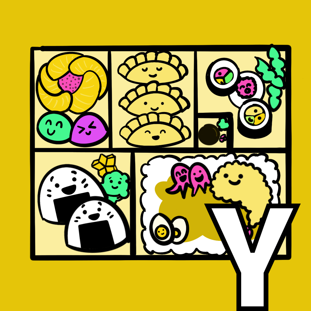
I appreciate how the definition of “yummy” has a definition around something being pleasing as well as delicious. When asked about my favorite food, I often reply that it’s whatever gives me bites of different foods—appetizer platters, dim sum, tapas and pinxtos, etc. Reminded of bento boxes and their pleasing presentation, I drew kawaii eats.
Note: This project continues a special series. The letters T-Y have been adopted by newsletter readers (you can read more about the why and how here). Abby, a friend I know through my work at Year Up, selected the word “yummy” as her project. I’m thrilled she picked this word since I almost chose “delicious” instead of “delight” when I worked on a project for D. I know you’ll find her take below on Alpha Projects as delightful as I do!
INSPIRATION
As a lover of all food-related activities (namely, eating), I knew right away that I wanted to dive into “yummy” for this project. At the very least, I knew that if my design inspiration ran dry, I would have an excuse to either cook or eat something delicious in the process.
Early on in the research, I uncovered quite the internet debate about the origin of the word yummy. Was it simply onomatopoeia? Did it come from baby-talk? Was it an ancient meditation mantra? The word has also inspired many fun derivatives - nummy, scrummy, om-nom, yum-yum - the list continues. With yummy on the mind, I started tuning in anytime I heard the word or one of its derivatives spoken in the wild. “Scrummy” showed up more than once in the Great British Bake-Off (scrumptious+yummy). My partner’s 10-month-old niece made a case for the baby-talk etymology through an endless string of yum-yum-yum-yum-yum (or, perhaps, num-num-num-num-num).
After some days of this, I became acutely aware of how frequently I was both hearing and using “yum” to react to any number of things - both food and non-food related. Going down the Google rabbit hole a bit with “yum”, I was blasted into my own past when I came across Mr. Yuk stickers.

Perhaps this is revisionist history, but I have vivid memories of these stickers plastered to just about every bottle that lived under my kitchen sink growing up. The stickers were designed for parents to alert their children to any poisonous or harmful chemicals that they definitely should not eat. I wondered why these fell out of vogue until I learned that two (1),(2) peer reviewed studies suggested that there’s little proof that these stickers were an effective deterrent (and may even have had an opposite effect).
CREATION
My charge was clear - I had to make a “yum” equivalent.
My motivation was threefold -
- I was admittedly overtaken by a pang of nostalgia
- I have been looking for an excuse to try out a bit of graphic design
- I had a few practical-use ideas, but I was really curious what kinds of creative uses folks might come up with for a “yum” sticker - in and outside the food world
Without much in the way of design technology, and equipped only with my work-issued HP EliteBook from - my guess - 2013, I signed up for a free trial of Canva and Figma. After some poking around, I realized that these tools were either too advanced for the task at hand, or too advanced for me at the moment (likely the latter).
I turned to my old faithful - Microsoft PowerPoint. Cue the collective groan. But I decided to look at it as a delightful exercise in tedium challenge.
Originals:

First, I wanted to create the truest-to-form facial features. I removed the color from the original, cropped it into pieces, and manipulated the different features to turn yuck > yum. I played around with PowerPoint-issued shapes and lines to try and recreate the expressions so that the resolution would be higher, and so I could make little tweaks to the tongue and eyes. My favorite touch here was adding the pink to the tongue.

Then I added the neon green background - and played around with a full neon palette for fun.

I looked at these and really loved them, but they didn’t evoke that same nostalgia and spirit of the Mr. Yuk stickers. I needed some nod to the “POISON HELP” and helpline number on the outer border of the original, otherwise, it just looked like an elaborate emoji.
I played around with some ideas and settled on “YUM!” for the top. I was wrestling over what could go on the bottom, and my partner wisely suggested adding the Alpha Projects url to replace the poison helpline. I can’t remember the last time I used WordArt, but it really came through for me here.

Finally, I brought it back full circle with the neon green:

I was too smitten to stop at this point, so I spent a few days researching sticker printing. A wildly helpful customer service agent taught me a surprising amount about printing digital art in a 15-minute phone call. She walked me through an easy hack for increasing the resolution of a PowerPoint-generated image, and explained the difference between RGB and CMYK color models - which explained why my vibrant neon green would print a little duller on the actual stickers. In a 3-day shipping miracle, I’m now the proud owner of 50 Dr. Yum stickers! (I settled on “Dr.” over Mr/Mrs/Ms)

REFLECTIONS
- In the spirit of past Alpha Projects - I found great delight throughout this entire process. Though initially intimidated by the boundless-ness of the task (which I made even more boundless by ignoring the initial deadline), I grew more curious and playful as I dug into the research, and I was more willing to try on different ideas before settling on one.
- I had to cut off a few strains of overthinking that were keeping me from diving into the creation. For example, I envisioned an elaborate plan for a whole Thanksgiving Day dish-rating system using the Dr. Yum stickers. Maybe that will happen someday. But for now, I’m excited that these exist without a defined purpose - maybe they’ll spark some ideas that I never thought of.
- Once I started the creation, I gave myself space to tweak and tweak the original design. It’s fun to look back on the evolution from the initial idea - it was a great example for me of the importance of moving past the first draft.
- I learned a few practical things about graphic design / print design along the way!
***
Editor’s note: I experienced so much joy from reading Abby’s post. I couldn’t wipe the grin off my face for a while. I had never heard about Mr. Yuk and I loved the inspiration to flip it to an inclusively named “Dr. Yum.” I enjoyed seeing her creative process and the resourcefulness in using Powerpoint in the sticker printing process.
CONNECTION(S)
Reminder: the project and write-up was submitted by a guest contributor, Abby Stemper.
For curated links and other content I couldn't fit into this post, subscribe to the email newsletter.