ILLUSTRATION
When I decided on a visual feel for ALPHA PROJECTS during the Alpha sprint, I limited myself greatly to the constraints of Notion. I chose Notion’s color palette due to fixed color options of components like that of the callouts, typography, and background.
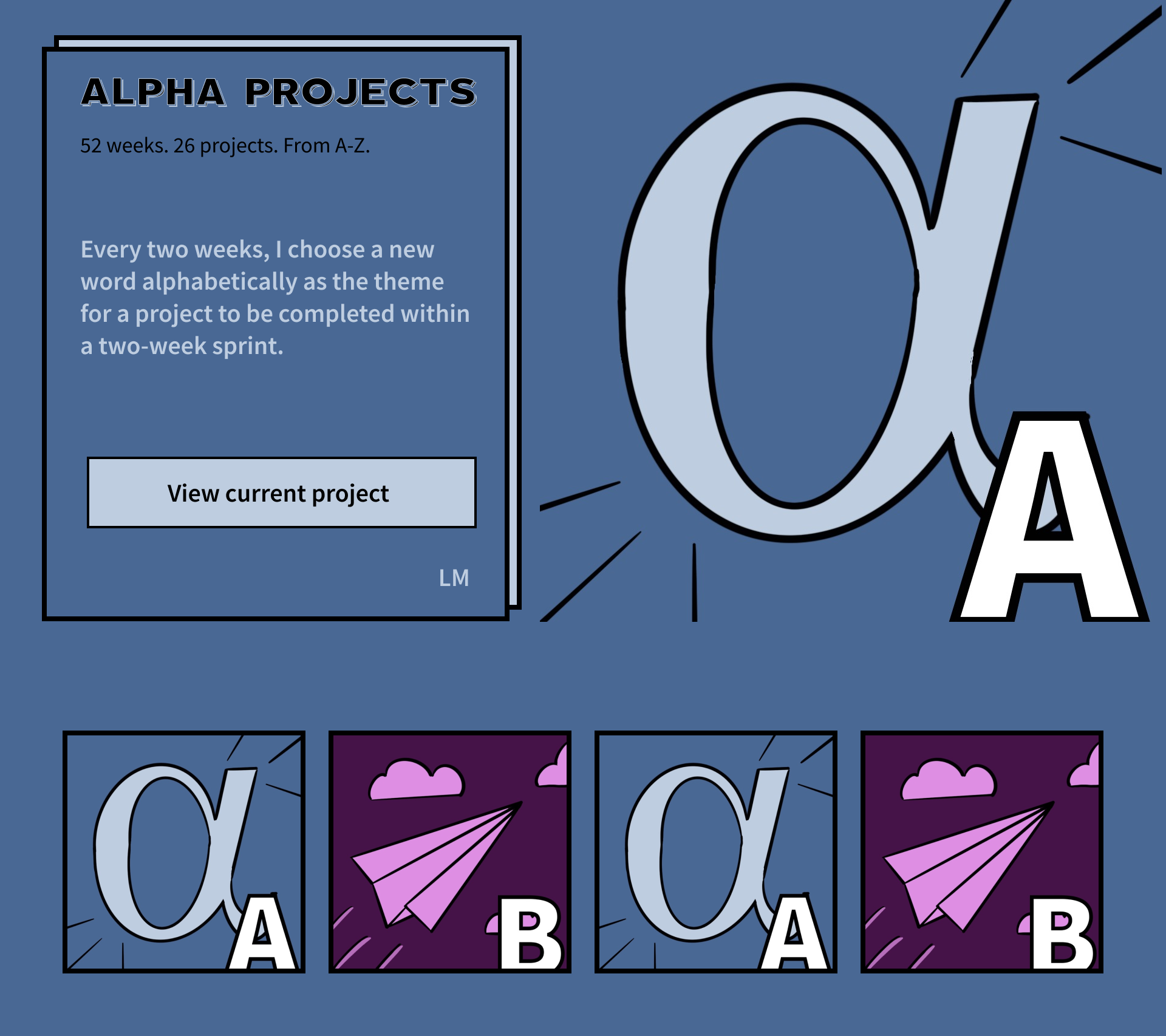
Starting fresh in the Beta sprint, a world of possibilities opened up. I did far more research, designing, and iterating as I explored broader color palettes, typography, and layouts for both the letter-word illustrations and the new website itself.
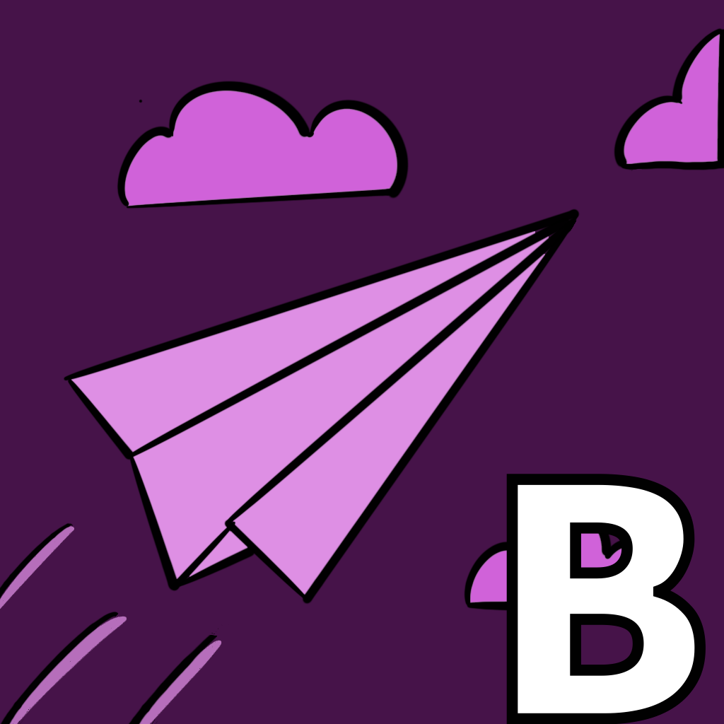
The artwork includes imagery of a paper plane because I’ve experienced a paper plane as the embodiment of a prototype in design thinking. A prototype is a good representation of the concept beta because often the product or service at that stage may end up changing based on user or community feedback.
INSPIRATION
Originally, I would not have chosen “beta” for the project word. My list included these words instead:
- balance
- boredom
- bold
- banter
- brevity
- bustle
When my fiancé saw the results of my "A" sprint in Notion, he offered me invaluable feedback that resulted in the site you're looking at now instead of this one.
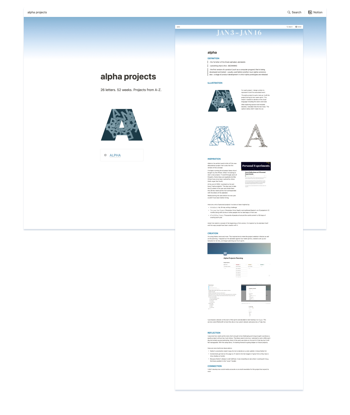
I had been excited to test the constraints of Notion in designing ALPHA PROJECTS there but my fiancé questioned why such constraints were necessary. After all, he could collaborate with me on the technical side to make something more fun that aligned with my personality. He encouraged me to follow my Alpha sprint with a Beta one to improve the design and make something I could truly be happy with — not too mention a website that would perform far better without any scaling issues.
CREATION
The Alpha sprint took time because I used it to plan out what ALPHA PROJECTS would be overall. It felt like I spent more time on the Beta sprint given the freedom from most constraints enabled me to explore more paths — both dead ends and long roads.
My fiancé was gracious enough to offer to take care of the technology for me in this round so I could focus on making the design have more personality.
First, I knew I wanted to replace the muted Notion palette for colors that spanned the 26 letters and the rainbow. I found a photo of a vintage color wheel with 30 hues that I digitally sampled.
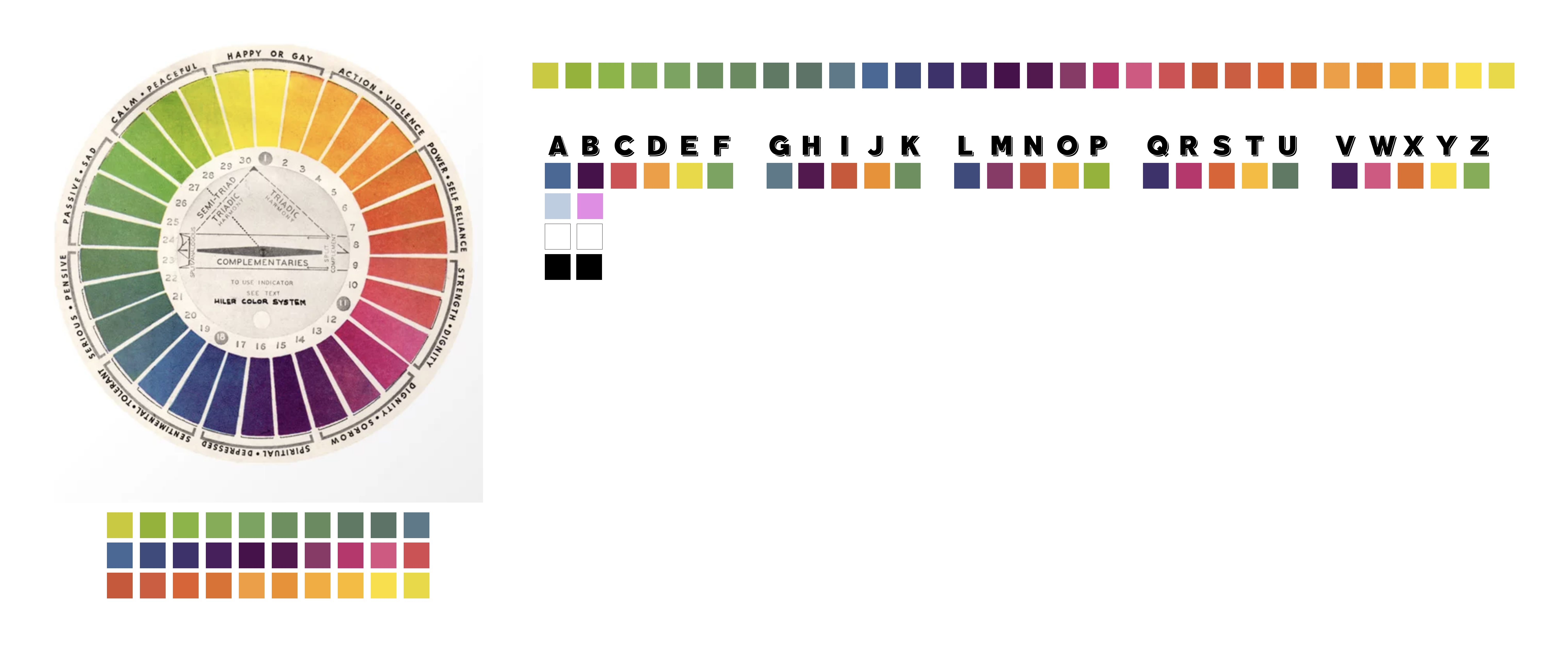
I made the Alpha illustration square and had plans to do squares for each letter. With the new color palette came the invitation to change how I visualize the letters. After searching for inspiration and experimenting with dozens of options, I finally landed on a look I was happy with that could work across 26 colors and feel cohesive. I used a similar process to consider the layout of the website.
REFLECTION
I’m fortunate my partner can call me out when I’m not doing my best work. I let my vision of the project’s visual design be constrained by technology. If I had started with an open vision, I would not have limited myself to Notion.
I’m reminded by how much work I need to put in to be happy with my visual design. I find it takes several rounds of experimentation and iteration before I’m remotely satisfied.
CONNECTION(S)
For curated links and exclusive content that couldn't fit into this post, subscribe to the email newsletter.